 ChatGPTChatGPT
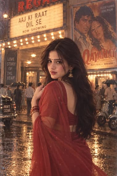
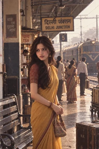
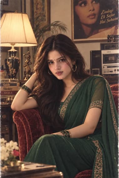
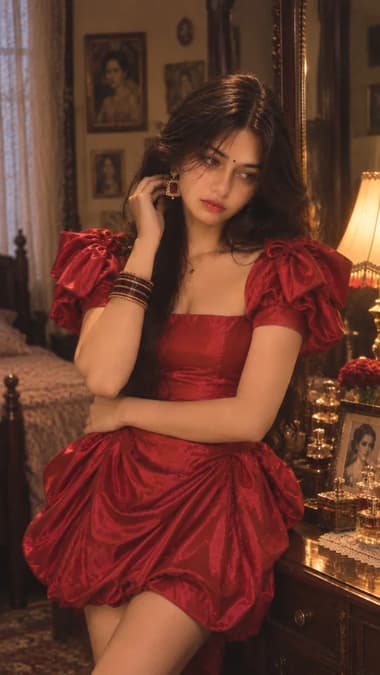
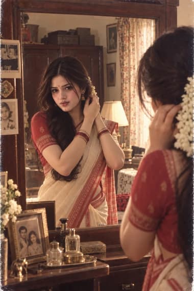
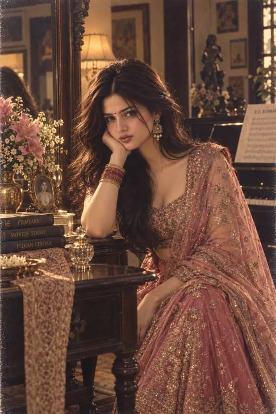
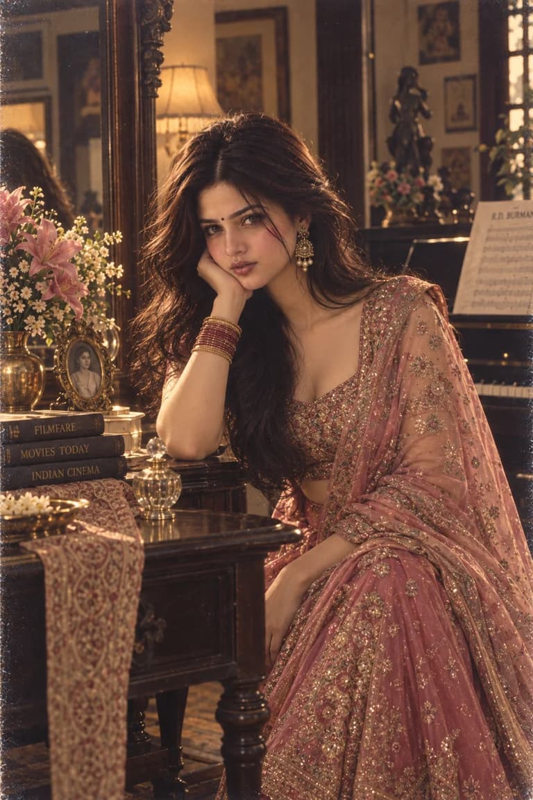
A luxurious late-80s Bollywood beauty editorial featuring a champagne silk saree, teal velvet blouse, and warm vintage lighting.

Quick workflow
Copy the prompt, customize any details, and generate in ChatGPT.
Open ChatGPT in your browser or app.
Upload your selfie to use your own face (or skip to make a new character).
Copy the prompt card above and paste it into the chat.
Press send to generate. Adjust any details you want.
Browse our curated library of tested AI image prompts or filter by your favorite tool.
Guide
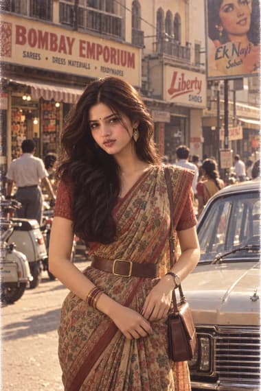
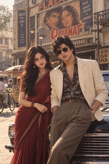
This prompt doesn’t just throw “80s Bollywood” at the model and hope for the best. It nails a very specific slice of the decade—the late-80s shift when editorial fashion in India started borrowing more from real women’s styling and less from filmi fantasy. Imagine flipping through a 1987 issue of Femina or Stardust: the saree isn’t the overly glitzy, sequin-heavy disco glare people often associate with the era. It’s champagne-gold silk that pools under warm tungsten light, paired with a teal velvet blouse that has structured, almost architectural sleeves. That combination—champagne and deep teal—was huge then. Designers were playing with jewel tones against neutrals, moving away from the all-over gold of the 70s.
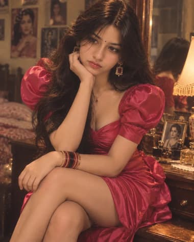
The prompt builds an old-money interior as the backdrop: dark wood, a hint of brass, nothing shouting. It’s a conscious choice because the trend wasn’t about looking loud. It was about quiet polish—kundan earrings that catch the light just enough, a single delicate necklace, stacked bangles that clink when you move. No choker overload, no maang tikka competing for attention. The makeup stays in that pre-airbrush zone: defined eyes with smudged liner, a soft berry lip, blush that looks like it’s coming from the skin, not sitting on top of it. If you follow vintage Indian advertising from the period, you’ll notice skin had texture. You saw pores, fine lines, the way silk catches thread imperfections. That’s exactly what this prompt forces: natural skin, real film grain, bokeh from a prime lens opened wide. It reads like a scan from a physical 35mm print—halation around bright edges, a little softness that digital sensors just don’t give you.
The full prompt is built for ChatGPT’s GPT Image 2 and you’ll find it on the detail page. It’s long because the more you leave unsaid, the more the model defaults to plastic bridal glam or that over-smooth “AI beauty” look. Every phrase—from the saree fabric to the rim-light warmth—is a constraint that says “not modern, not insta-glam, not fantasy.” This trend wasn’t about going viral; it was about looking like you stepped out of a magazine that actually printed on paper.
GPT Image 2 usually gets the analog grain and tungsten warmth right, but it has a habit of softening faces when it sees the word “beauty.” If the subject starts looking like a skincare ad, add a small override before the lighting cues: “visible pores, fine texture, no skin smoothing.” That returns the editorial grit. The prompt already stacks the identity-reference instruction early, which helps. If you’re tweaking it, avoid any word that hints at studio airbrushing or “flawless” skin—those will undo the whole period feel. The warm tungsten and rim-light notes are not optional; pull them and the scene flattens into generic neutral light that could be any decade, or none at all.
ChatGPT (GPT Image 2)
The model responds best when the identity-reference instruction sits at the top and the prompt resists layering “pretty” filters. If the skin starts turning porcelain mid-generation, strip any language that even hints at retouching. Keep the warm tungsten and rim-light cues exactly as they are—those directional lighting terms anchor the period look far better than adding more period-specific objects ever will.
FAQ
Yes, but you’ll get a generic face. If you want the exact look of a specific person, the identity reference instructions are essential. Otherwise, just remove the first paragraph and the model will invent a face that matches the styling.
ChatGPT (GPT Image 2) and Gemini (Nano Banana Pro) are best at interpreting the analog photography directions. Qwen-Image can be hit or miss with film grain, but adding extra emphasis on texture helps. Grok Imagine handles the lighting beautifully.
Stress the film grain, halation, and softness. Also mention “muted warm tones, slight color fade consistent with print storage” if the output still looks too digital. Adjusting the prompt to “scanned from a 1988 magazine” can nudge the model further.
Next ideas
 ChatGPTModel:GPT IMAGE 2.5